How to Read a Liquidation Map: Heatmap, Magnet Levels and Stop Hunts
A liquidation map doesn't show you price — it shows you where the leveraged money sits and where its stops are. Every leveraged position has a forced-close price. Stack millions of them together and you get a map of the levels where exchanges will be forced to close traders with market orders. Markets move toward liquidity, and the thickest liquidity is exactly there. Here's how to read that map, step by step.
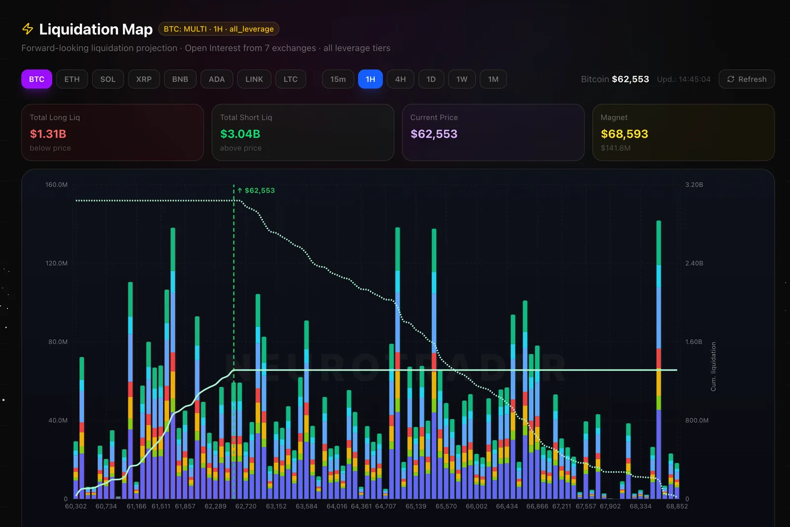
How the Map in the Screenshot Works
On the NeuroTrader map, price runs horizontally and the dollar value of liquidations at each level runs vertically. It isn't one smooth heatmap but bars per price level — and they're easy to read:
- Tall bars — thick liquidity pools: the most stops and margin closes piled at that level. These are magnets.
- Short bars — few positions; price passes through fast and without resistance.
- Colored layers inside a bar — the breakdown by leverage (purple / blue / green, etc.): the higher the leverage, the nearer the liquidation price and the more easily that pool cascades.
- Dotted line — cumulative liquidation: how fast total volume builds up as you move away from current price.
- Vertical line at $62,553 — current price. Long pools sit to its left, short pools to its right.
What the Numbers on Top Tell You
The four metrics in the screenshot read in a second — and hand you the bias straight away:
- Total Long Liq $1.31B (below price) — how many longs would be liquidated below price.
- Total Short Liq $3.04B (above price) — shorts above price. There's 2.3× more fuel here → the bias leans toward a squeeze up.
- Current Price $62,553 — the reference point the pools are measured from.
- Magnet $68,593 ($141.8M) — the densest short cluster above. This is the main magnet: the level price is most likely pulled to, and a logical TP target.
Magnet Levels: Where Price Is Pulled

The core principle: price gravitates to the nearest large cluster. Market makers and big capital need liquidity to fill size — and a pool of stops provides it for free. That's why moves often look “illogical” to technical analysis but are perfectly logical on a liquidation map: price heads where the forced orders wait.
- Cluster above is closer → higher odds of a short squeeze upward.
- Cluster below is closer → higher odds of a flush that wipes longs downward.
- Price pinned between two clusters → expect an impulse toward the denser one.
Leverage Clusters and Stop Hunts
Stops always sit under local swing highs and swing lows — that's visible liquidity. The map shows exactly where it's thickest. A typical stop-hunt plays out like this:
- Stops build up. A cluster of longs with stops accumulates under an obvious support.
- Liquidity grab. Price spikes through the level, triggering a cascade of long liquidations — the pool gets eaten.
- Reversal. The fuel is spent and price snaps back. A fake breakdown → an impulse the other way, toward the next cluster.
So a bright band is not a level to enter toward — it's a zone where moves often end. Experienced traders use a cluster as a target (TP), not an entry.
How to Trade the Map: 4 Rules
- TP at the cluster. Place take-profit just before a bright band: price is pulled there but often reverses inside it.
- Don't enter into the wall. Don't open a position straight into a dense cluster in the direction of the move — price may reach it and turn.
- Wait for the sweep. The best entries come after the near cluster is swept and structure reverses (a fake breakout).
- Confirm with trend and structure. The map tells you “where”; market structure and order flow give you the timing.
The Liquidation Map on NeuroTrader
On the NeuroTrader platform the map is built from real exchange data and updates in real time. You get:
- A heatmap of liquidation density above and below current price
- Highlighted nearby magnet levels — where price is most likely pulled
- A split into long and short pools so you know the direction of the fuel
- Pairing with imbalance zones (FVG) and market structure for entry timing
- Support for BTC, ETH and other liquid assets across multiple timeframes
Conclusion
A liquidation map translates the chart into the language big capital actually thinks in: where the stops are, where the leverage is, where the fuel is. Don't trade “by lines” — trade by liquidity. Let price sweep the near cluster, wait for structure to reverse, and set your target on the next pool. Someone else's liquidations are your roadmap.
The liquidation map in real time
See the magnet levels and liquidity pools, and aim your target where price is pulled.