History Doesn't Repeat, But It Rhymes: Bitcoin Fractals and Seasonality
The line usually attributed to Mark Twain gets quoted so often by traders that it has worn smooth: "History doesn't repeat itself, but it rhymes." It normally appears in place of an argument — two similar-looking charts side by side, presented as if that settles something. There is a workable idea in it, but only if you take it literally.
A rhyme isn't a copy. It's a match in structure with different content. Bitcoin has traded for over a decade through several complete cycles, and the number of shapes a chart can take is finite: rally → overheat → return to the moving average → accumulation → impulse. Prices change, participants change, the news and the size of the market change. The sequence of phases changes far less.
Which leads to the practical question the Bitcoin Fractals indicator answers: if today's stretch of chart resembles something in history — what exactly, and how strongly? And more importantly, what happened next in those cases?
Why eyeballing it doesn't work
Comparing charts by eye is the fastest way to fool yourself. The human brain finds patterns even where none exist — pareidolia, and it works flawlessly on price charts. You remember 2018, find a stretch that "looks like" today, and from that point on you only notice the confirmations.
There are three problems, and each one is fatal to the conclusion:
- You're searching the wrong space. Memory surfaces two or three vivid periods, while the comparison needs to run against every comparable window in the entire history.
- Scale deceives. The same path at $6,000 and at $80,000 looks nothing alike, even when the shape of the move is identical.
- There's no number. "Looks similar" is not a measurement. Without a number you can't separate a strong analog from a forced one — and that distinction is the whole thing.
So the search has to be taken away from the human and handed to mechanics. Not to "predict" anything, but to measure honestly how strong the rhyme actually is.
How the engine finds an analog
It takes the current window — the last 26 weeks (a six-month swing view) or 52 weeks (a full yearly cycle). That window becomes two independent descriptions:
- Path shape. Log returns rebased to the start of the window. It answers "how did price move" independently of price level — which is exactly what makes 2015 and 2026 comparable at all.
- Distance to the moving average. How far price sat from the 50-day or 200-day MA each week. This is the part a trader actually watches: did price hug the average, tear away from it, come back to it.
Then every historical window of the same length is scored against the current one on three measures: correlation of the shapes (do they move alike), RMSE between the paths (how far apart they drift), and how closely the MA distance matches. Those collapse into a single number — similarity from 0 to 100%.
Two details keep the result from being garbage. Shapes are normalised before comparison — otherwise a calm 2026 window and a violent 2015 window tracing the same path would score as "different" purely because of amplitude. The amplitude difference is kept separately so any projection can be scaled back to real volatility. And windows overlapping the current one are excluded outright — otherwise the best match would always be "last week", which tells you nothing.
The output is up to six non-overlapping analogs, each with an honest similarity score.
What the overlay actually shows
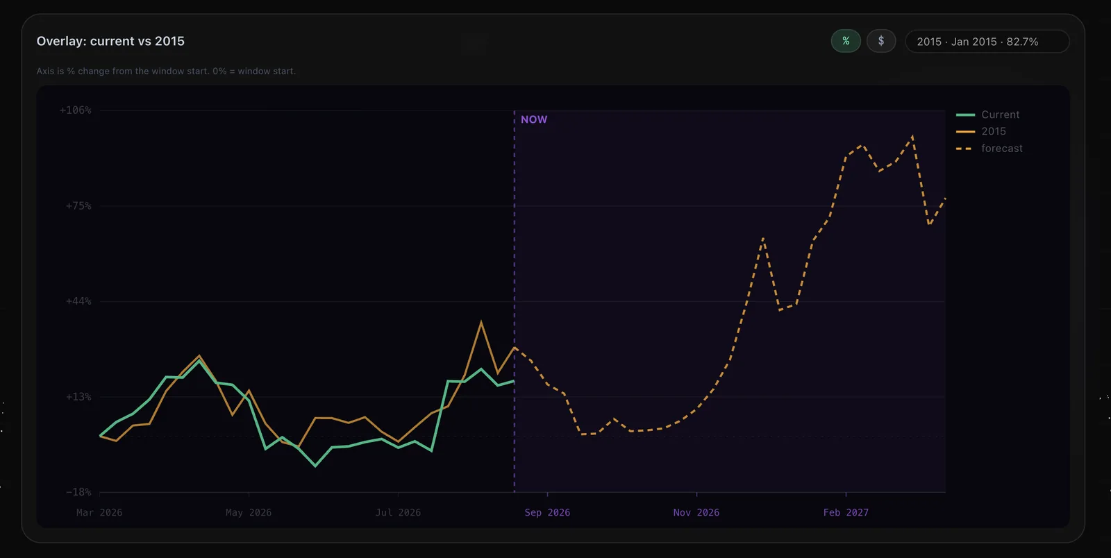
Above: the current window (green) and the analog the engine found, January 2015 (orange), at 82.7% similarity. Both curves are rebased to zero at the window start, so the axis is percentage change rather than price — the comparison is of paths, not levels.
Read the chart in two halves. Left of the NOW line is the rhyme itself: two periods eleven years apart moving through an impulse, a pullback, a long sideways stretch and a push higher almost in step. Right of NOW, dashed, is not a price forecast — it is what really happened afterwards in that analog: a pullback first, then accumulation, and only then a strong advance.
The difference between those halves matters, and it deserves bluntness. A match on the left does not guarantee a match on the right. The dashed line is a scenario with a known history, not a promise. 2015 was an exit from a bear market with an entirely different participant mix — no ETFs, no institutional flows, and a market capitalisation hundreds of times smaller than today's.
Its value lies elsewhere: it gives you a reference path defined in advance. If the analog implies a pullback before the advance and price instead runs straight up, you know immediately that the rhyme has broken. That is the real use — not a prediction, but a criterion that tells you when you were wrong, before you sit in a position talking yourself into staying.
The other half: seasonality
A fractal answers "what shape does the current move resemble". It knows nothing about the calendar. And with Bitcoin the calendar carries information — a separate layer of statistics that is independent of chart shape.
Seasonality measures, across all available history, how BTC behaved in each calendar month: average return and the share of months that closed green. There is nothing mystical about it — it falls out of very ordinary things: tax calendars, quarterly fund rebalancing, thin summer liquidity, institutional money arriving late in the year.
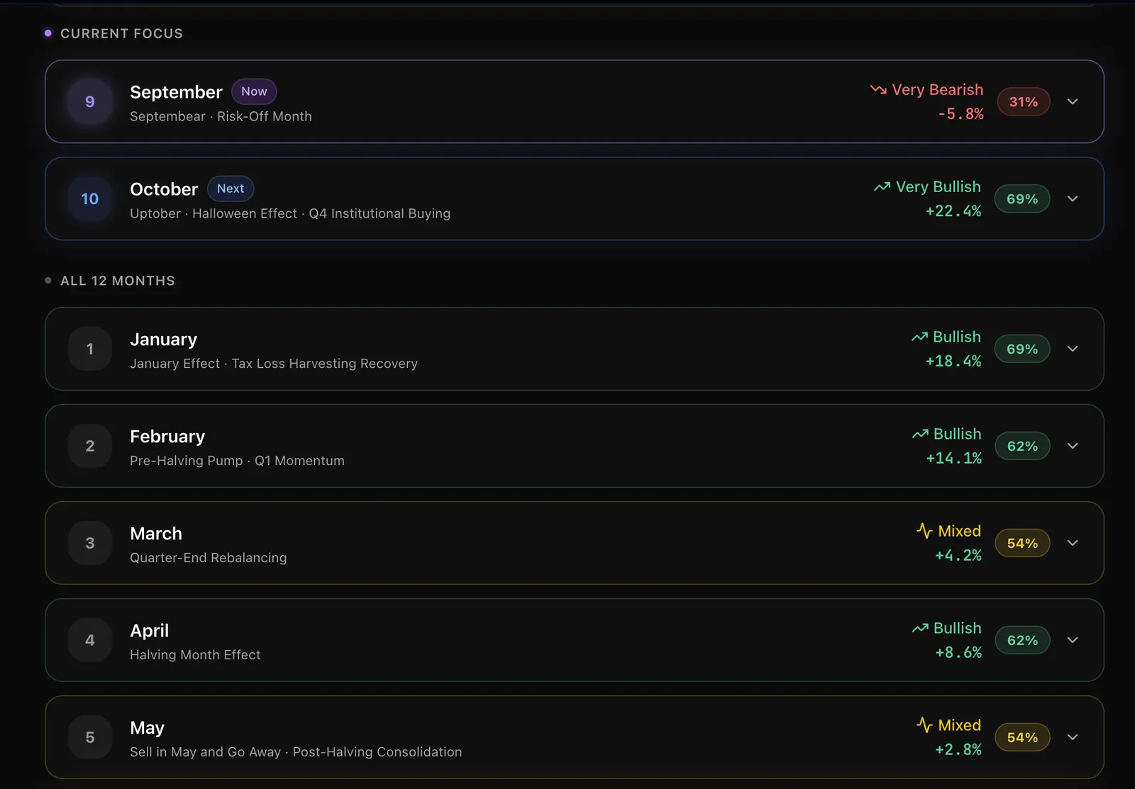
The pattern is stable and fairly pronounced. September is the one clearly negative month: −5.8% on average with only 31% of Septembers closing green — traders have long called it "Septembear". October is its mirror image: +22.4% average and 69% positive, hence "Uptober". January and February are strong on the turn-of-year effect, while March and May are statistically muddled — "Mixed", which is useful information in itself.
One thing usually left unsaid deserves saying: Bitcoin has roughly twelve years of history. Twelve Septembers is a small sample. Seasonality is an observed tendency, not a law of physics, and a single anomalous year can move the averages noticeably. That is why the percentage sits next to every month — 31% and 69% tell you far more about reliability than the return figure does.
Why the two together beat either alone
Here is the core of it: fractals and seasonality look at the market from different angles and know nothing about each other. The fractal sees only the shape of the move and has no idea what month it is. Seasonality knows only the calendar and is blind to current price structure.
That independence is precisely why their agreement carries information. When two unrelated ways of looking at the market point the same way, the odds that it's coincidence fall. When they disagree, that isn't a malfunction — it's an honest "no edge here, the conditions haven't lined up". That verdict saves more money than the average good entry makes.
In practice it looks like this:
- Agreement. A high-similarity analog implies upside and the calendar leans the same way — the scenario earns weight. Not an entry command: an argument for a hypothesis you were already considering.
- Disagreement. The fractal points up but the month is historically weak — wait for confirmation from price structure and don't rush the size.
- A weak rhyme. The best analog only scores 50–60% — meaning nothing comparable exists in the record. That is also an answer, and it should be accepted rather than mined until it says what you wanted.
A third layer always worth adding is current market structure: volume, the behaviour of large participants, levels. History speaks about probabilities; structure speaks about what is happening right now. The decision lives where they intersect.
How to use it in practice
- Check the similarity score before the shape. Below 70%, an analog is an interesting observation but not something to lean a decision on.
- Cross-check both modes. The 50-day MA gives the six-month swing view, the 200-day the yearly cyclical one. Agreement across both horizons is rare and meaningful.
- Use the dashed path as an invalidation criterion. Decide in advance which move means "the rhyme failed" — and know in advance what you'll do then.
- Don't size up because an overlay looks beautiful. 82% similarity describes chart shape, not the probability of your particular trade.
What this isn't
It is not a prediction machine and not financial advice. Fractal analysis has honest, well-known limits: Bitcoin's history is short, the composition of the market has changed radically, and any search for similarity in a long enough data series will always find something — the only question is how strong the find is. That is why the indicator shows the similarity number openly instead of hiding it behind an attractive picture.
We provide a measured probability and the reasoning behind it. The venue, the risk, the position size and the decision itself remain yours.
The takeaway
History genuinely doesn't repeat. But markets have a limited vocabulary of shapes, and when the current one matches a past one by more than 80%, that is not mysticism — it is a measurable observation. Add calendar statistics that know nothing about chart shape, and instead of a feeling that "this kind of looks like 2015" you get two independent voices and an honest reading of how much they agree. That isn't certainty. It's probability — and trading is made of nothing else.
Find your rhyme in BTC history
Analogs of the current cycle with similarity scores, chart overlays and monthly seasonality — in one indicator.